Friday, December 12, 2014

Holiday Series: Personalized Decor Gifts (and 20% Off Code!)


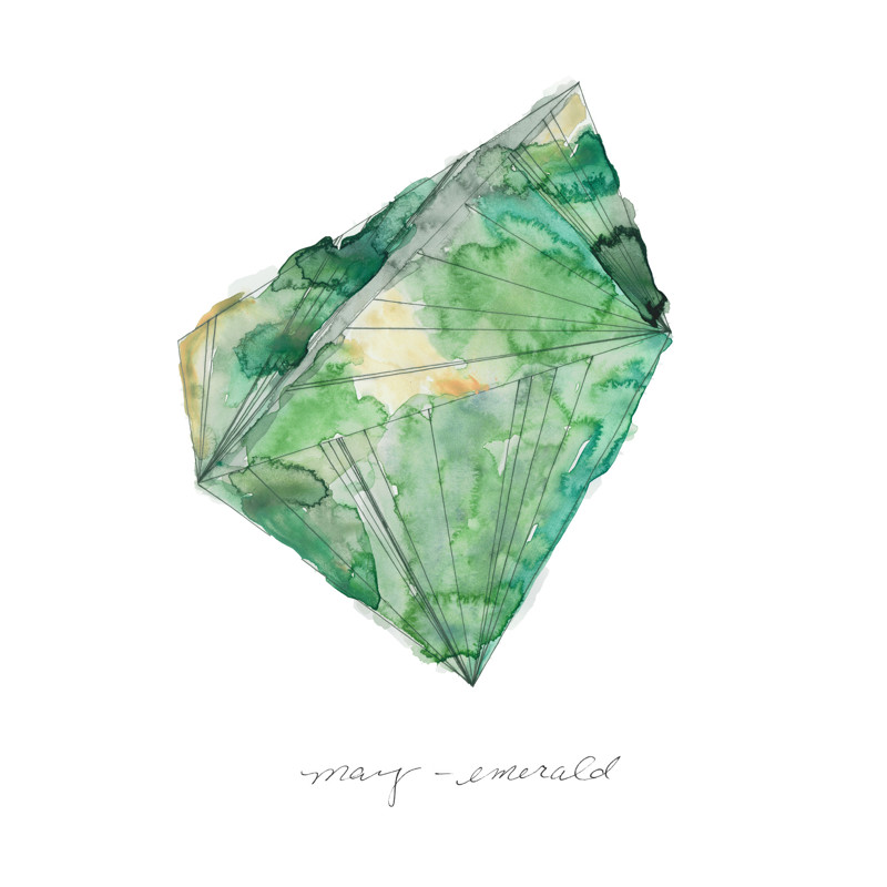
Looking for a great personalized present that will arrive in time for the holidays, and help add a unique design touch to the home of your friend or family member?

These designs available through Minted, are produced by an artist right here in Ann Arbor, Michigan.  They're beautiful watercolors - and some designs have real gold foil that adds a touch of festive glitter/shine to these pieces.  Perfect for the holidays, or anytime.

They're not only beautiful and unique, they support a local artist.  What a great personalized gift idea!

If gems aren't your thing, how about Zodiac Signs with gold foil accents?


Also use the code GIFT20 for 20% Off Art orders from Minted!


Tuesday, December 9, 2014

Kelly Wearstler: Wine Colors


Celebrity Interior Designer Kelly Wearstler is recognized as a trend-setter, with dramatic taste.  In this case, she was ahead of her time in 2008 when she designed the rooms above, which fit in perfectly with Pantone's Color of the Year 2015: Marsala (wine).


For more on these rooms, visit Apartment Therapy.


Monday, December 8, 2014

Rose-Colored Glasses: Rosy Retro Trends in Design

The recent announcement of Pantone's 2015 Color of the Year (Marsala, an earthy mid-tone wine-rose), we couldn't help thinking we had seen this color before...  Which got us to reminiscing about design trends of the past.

Here are just a few examples from pop culture involving wines, rose and earthy red tones.


Also 1980s contemporary designs (below: one ultra modern and graphic, the other soft and glamorous) often featured warm rose or wine tones.


And one of the most obvious, wine rose florals!


Finally we wanted to send you off with two modern takes on warm wine and rose tones!  Below, the first graphic wall treatment is from a Kelly Wearstler Interior c. 2013.  The second is a purposely retro and vintage design featuring a 1980s shelving unit and 1980s pottery.


Thursday, December 4, 2014

Pantone Announces 2015 Color of the Year & J. Rohr Listens!


Pantone announced their 2015 Color of the Year, following some bright choices the past few years -- including a vibrant cobalt blue, two orange-coral shades, two teal leaning greens, and most recently: Vibrant Orchid for 2014.

We've been waiting to see what the color for 2015 would be, because it sets design, fashion, make up trends and more.  From the runway to the store shelves, you can be sure we'll be seeing this color in the coming year.

It's a soft, flattering, rosy shade that's organic and earthy.  Right on trend, it's retro and reminiscent of the contemporary and southwest interior design trends of the 1980s (more on that this week!).

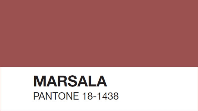
Without further ado, here it is: Marsala, Pantone's 2015 Color of the Year.


This color immediately calls to mind another big design trend right now: Kilim accents (from rugs, to pillows, wallhangings, and more).


We can imagine Marsala being right at home in Moroccan-inspired rooms like these below...


And also in eclectic and bohemian-inspired rooms...


Finally, it also fits in well in southwest and rustic/primitive/cabin home designs.


Tuesday, November 25, 2014

Historic Pigments On Display, Colors of the Past (Harvard Art Museums)


A new exhibit at the Straus Center of the Harvard Art Museums, newly reopened November 2014 after a 6 year renovation, features examples of actual historic pigments. On display, patrons get to see the real shades of red, green, blue and more that were used to create painting, textiles, and other art of previous eras -- many in their original glass bottles.


Understanding how pigments may change over time (something painted red in 1850 may look yellow to our eyes today, affecting how we perceive and interpret the art), led to modern conservation efforts. The Straus Center today houses a cutting edge conservation laboratory.

"Through glass walls visitors can see scientific conservation in process, which goes back to [another Harvard art institution] the Fogg’s founding in 1927 and pioneer conservationist and director Edward Waldo Forbes. While collecting art around the world for the new museum, Forbes got intrigued by how paintings were made, and why some deteriorated. Gradually and then obsessively he amassed a collection of painting pigments, many of which are displayed in their original glass containers on a wall of the Straus Center." Says online Art site, Hyperallergic. Perhaps the site is aptly named, knowing many historic pigments contained poisons, and caused reactions up-to-and-including death.


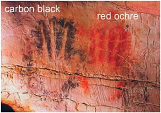
According to Wikipedia, "The earliest known pigments were natural minerals. Natural iron oxides give a range of colors and are found in many Paleolithic and Neolithic cave paintings. Two examples include Red Ochre... and Yellow Ochre (Fe2O3.H2O). Charcoal, or carbon black, has also been used as a black pigment since prehistoric times. Two of the first synthetic pigments were white lead and blue frit (Egyptian Blue)."


"The Industrial and Scientific Revolutions brought a huge expansion in the range of synthetic pigments, pigments that are manufactured or refined from naturally occurring materials, available both for manufacturing and artistic expression. Because of the expense of Lapis Lazuli, much effort went into finding a less costly blue pigment."

An of course, advances in pigment science affect more than just art we hang on our walls (or in galleries and museums). The pigments available to artists affect changing aesthetics of the times -- reflected in everything from decor to clothing and much more. They can also affect our way of life:

"Discoveries in color science created new industries and drove changes in fashion and taste. Organic chemistry delivered the final blow for the cochineal color industry. When chemists created inexpensive substitutes for carmine, an industry and a way of life went into steep decline."

Thursday, November 20, 2014

1800s: Green Wallpaper Responsible for Thousands of Deaths


Throughout the ages, people have suffered for what is fashionable.  In the 1800s, thousands of people died to to exposure to arsenic used in producing green wallpaper (not to mention green clothing, hats, shoes and much more).

"[Arsenic] was used in the production of green dyes, which were incorporated into everything from ribbons to playing cards. [T]he craze for deep green wallpaper...led to thousands of families meeting their deaths as a result of their taste in home furnishings. Not that they actually licked their walls: the dye was very unstable, so the slightest breeze could dislodge a puff of toxic dust." 

"Queen Victoria herself was so appalled by the homicidal tendencies of green wallpaper that she ordered every room in Buckingham Palace to be stripped of the stuff." Kathryn Hughes of The Guardian explains in a review of the new book by author James C. Wharton, The Arsenic Century.

It makes us very glad that arsenic is not used in the production of green dyes for home or textiles today!


Monday, November 17, 2014

Shop Small for Holiday Gifts @ An Etsy Trunk Show


Shop Small on November 29th, Small Business Saturday, by attending an Etsy Trunk Show near you -- and knock out your holiday gifts at the same time.

Another tip: If you have an American Express card visit the Small Business Saturday directory and website regularly - as AmEx usually offers cardholders a special discount or statement credit for shopping a participating small biz on the event day.


Saturday, November 15, 2014

Real J. Rohr Clients: Inspiration for a Dining & Living Room


This room was the color palette and "feeling" inspiration for a family living room/dining room for one of our current J. Rohr design clients.  We chose to go a little deeper with the main wall color in the clients room to add drama and color (deepening from the khaki used in this inspiration, to a more intense olive shade in a similar family).

To get a solid shot of yellow-gold in our clients' room, we also painted an entire accent wall in a vivid harvest color.


The grey-blue used in the room below will likely be a favorite accent color.


Additionally, the client is adding custom wainscoting and crown molding to the dining area.


Here's the project below, at our clients' home, midway through this week -- paint is up, and working on the wainscoting.  Next will be finishing the wainscoting.  We'll update you once the project is closer to completion -- please check back!


We were lucky enough to find this vintage piece at a local resale shop -- we can't wait to see it in the home.


Textured Wool Carpets - Luxe, Unique, Eco-Friendly


Looking for unique carpet options that are outside the norm?  We can recommend sore unique textured and sculpted options, in dozens of modern and classic styles. 

In fact, there are new blended styles that go beyond plush or twist, and offer a serious design statement.  From exotic (faux!) hide prints in cheetah or zebra, to geometrics, these carpet options really increase your style factor at home.


Besides looks, wool carpets have other benefits as well.

According to Stanton, a quality carpet manufacturer, fine quality, all-natural wool offers numerous advantages when used in flooring. It has been the standard in floor covering for centuries and represents all the qualities that synthetic fibers try to emulate:

  • BIODEGRADABLE Wool is a biodegradable natural fiber and one of the most environmentally forgiving flooring products.
  • RENEWABLE Wool is a renewable product and therefore has less impact on the environment.
  • SUSTAINABLE LIFE CYCLE Wool has a longer life cycle than other fibers resulting in a smaller environmental footprint.
  • NON ALLERGENIC Wool is a non-allergenic fiber and does not promote the growth of bacteria and dust mites, or give off harmful emissions.
  • STAIN-RESISTANT Wool cleans better and won’t soil quickly due to its natural soil resistance, making chemical stain protection treatments unnecessary.
  • AIR PURIFYING Wool fibers absorb and neutralize polluting gases such as formaldehyde, sulphur dioxide and nitrous oxides.


Wednesday, October 29, 2014

Monday, October 27, 2014

Eco-Friendly (and Energy-Saving!) Floor and Window Products


These greener options don't skimp on style or quality!  From energy-saving window treatments, to renewable bamboo floors and recycled carpets, J. Rohr has what you're looking for in terms of environmentally-friendly home design products.

Here are a few of the latest products we recommend:

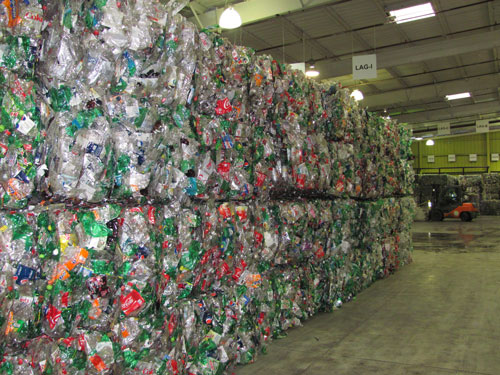
Shaw Cleartouch recycled carpet: made from recycled plastic bottles, is a high-quality, long-wearing and ultra soft fiber.  It's a luxury choice that's also easier on the environment.  Carpet is also one of the best-insulating flooring choices, helping you save a bit on energy costs (upgrading to rubber pad with help even more, especially if your room is on a slab).

Hunter Douglas Duette Architellla Honeycomb Shades are considered an insulation material by some building codes!  They not only keep your home cool in the summer by shielding direct sun (and they protect your carpet and fabric investments!), they insulate your windows and that means less spent on heating and cooling.  Ask us about other energy-saving window treatments as well.

Bamboo wood flooring is beautiful and modern, and grown from renewable resources.  Bamboo requires little or no fertilizer or herbicides as it's grown, so there's less impact on the environment.

Short & Sweet: Halloween Decorating Tip!


Halloween Centerpiece: Fill vase with candy, like candy corn (small candies work well to fill the space).  You can add flowers, or just let the candy stand on it's own.  For plants that need water, set them in a thinner vase in the middle of the big vase and fill the space between with candy.  Enjoy this week leading up to Halloween!


Tuesday, October 14, 2014

Charming St. Clair Shores Home - Real Life Design Inspiration (and Just Listed for Sale)!


This local St. Clair shores home was recently remodeled, and the kitchen is a great inspiration for real-life design.  By the way, it was just listed for sale, if you love it as much as we do!

The layout was changed just slightly to make better use of the space: increasing storage for hidden recycling and garbage containers, and maximizing usable counter space.


Additional storage was added in the form of open shelving for large platters, bowls, and small kitchen appliances next to the pass through area.

The kitchen upgrade was well planned and well executed, with attention to detail -- like the charming Bridge style kitchen faucet, and apron-front stainless steel farm sink.  The traditional high quality pulls on the cabinets add charm and sparkle.


The granite countertops coordinate with the two-tone kitchen cabinets, in white and grey-blue; it's a look that's stylish and unique --but still neutral with universal appeal.

Check out more photos of the entire home (just listed for sale!), which has great traditional curb appeal, professional landscaping, and features a large finished basement with a second kitchen.

Saturday, October 11, 2014

An Exclusive Look Inside Detroit's Masonic Temple (Great Design Details!)

Lush textiles in deep colors lend richness and warmth to large rooms;
jewel tone and gold accents add drama.

To find amazing examples of design and attention to detail, we need look no further than Detroit's historic landmark structures.

Masonic Temple is no exception, and it has an interesting backstory as well (read on for more).

Local Detroit-area photographer Bruno P. Vanzieleghem recently enjoyed a tour of the historic building, and took some amazing shots -- which thought we were well worth sharing.  (View the full album of Bruno's Masonic Temple photos.)

Ceiling detail and light fixture at Detroit's Masonic Temple.
"Masonic Temple has over 1,000 rooms. Of those rooms, 142 are men’s bathrooms while only 8 are designated for women. Many of us have visited some of these rooms. The Masons are masters of hiding symbolism and messaging in plain sight," says Shannon Saksewski at AwesomeMitten.com.

"For example, at either end of the main entryway on Temple St. are the words 'veritas' (truth) and 'fortitudo' (strength). Freemasons stress the importance of living in line with these two virtues. When entering and departing the building, one is reminded to continue to strive to meet this expectation. Indeed, architect George D. Mason designed the building so that members and visitors could literally stand between, and in line with, these words." Read more about Masonic Temple.